
Classique – User Guides
Overview
Classique is a modern and versatile Shopify theme designed primarily for fashion stores. With its elegant layouts and refined styling, it provides the perfect foundation for showcasing clothing, accessories, and lifestyle products. Beyond fashion, Classique is flexible enough to support a wide range of industries, including electronics, cosmetics, furniture, and more.
Built with advanced customization options and powerful features, the theme enables merchants to create a unique shopping experience without technical complexity. From global design settings to highly configurable sections, Classique delivers both style and functionality, making it a reliable choice for growing online businesses.
Settings
All settings in this section are global configurations, meaning they affect your entire online store. Any change you make here will be applied consistently across all pages, including the homepage, product pages, collection pages, blog, and others.
This ensures:
- Consistency: Design and functionality remain uniform across the whole site.
- Efficiency: You only need to configure once, without repeating settings on individual pages.
- Flexibility: Global changes (like colors, typography, popups, or custom scripts) can be managed easily in one place.
Logo
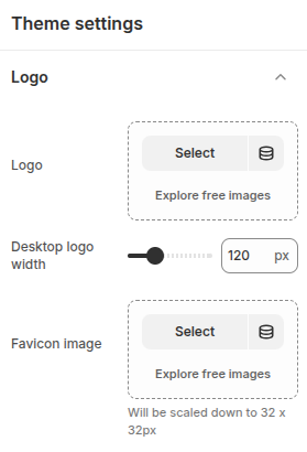
The Logo settings in Shopify let you upload and customize your store’s main logo and favicon. You can adjust logo size, placement, and alignment, while the favicon ensures your brand is instantly recognizable in browser tabs and bookmarks.
- Logo: Configuration to select a logo image.
- Desktop logo width: Adjust the width of your store’s logo for the best fit on your website.
- Favicon image: Configuration to select a favicon image.
Colors
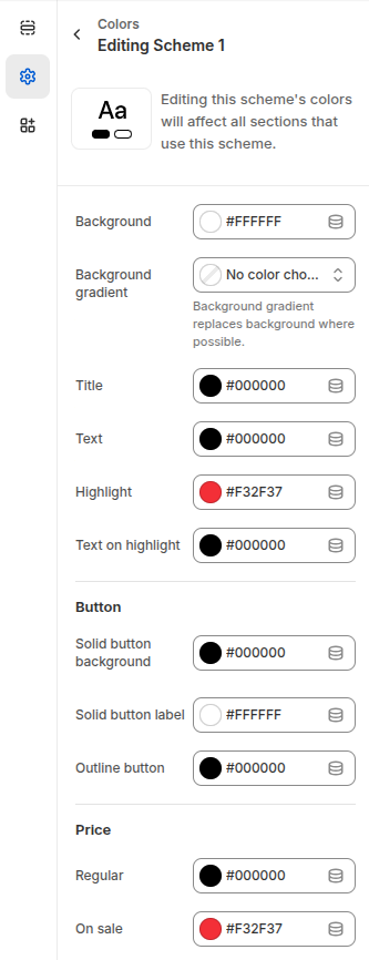
The Color Scheme settings in Shopify let you customize the look and feel of your store by defining consistent colors across sections. You can set the background, gradient, titles, text, and highlights to match your brand identity. Button styles are adjustable with options for solid or outlined designs, while price settings allow you to differentiate between regular and sale items. These configurations ensure your store’s design remains cohesive, professional, and visually appealing across all pages.
- Background: The Background setting in Shopify’s Color Scheme allows you to choose a solid color or apply a gradient as the backdrop for your store sections.
- Title: Configuration for elements defined as titles.
- Text: Configuration for text or certain other elements.
- Highlight: Configuration for certain special elements.
- Text on highlight: Configuration for elements placed on top of special elements.
Button
- Solid button background: Background color configuration for buttons.
- Solid button label: Text color configuration for buttons.
- Outline button: Color configuration for outline-style buttons.
Price
- Regular: Color configuration for default prices.
- On sale: Color configuration for sale prices.
Typography
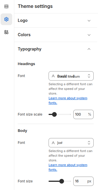
The Typography settings let you customize your store’s fonts for headings and body text. Choose from Shopify’s font library and adjust sizes to create a clear, consistent, and branded look.
Headings
- Font: Select a heading font from Shopify’s font library (system fonts and Google Fonts).
- Font size scale: Adjust the overall size scale of heading text (%) to increase or decrease all headings consistently.
Body
- Font: Choose a body text font from Shopify’s font library to ensure readability and brand consistency.
- Font size: Set the body text size (px) for optimal legibility across your store.
Layout
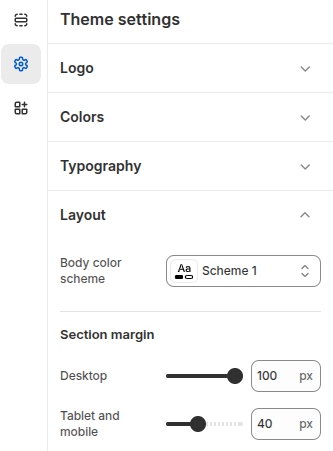
The Layout settings provide global configuration for your store’s sections.
Body color scheme: Defines the color scheme for the store’s body, controlling background and text colors.
Section margin (Desktop) – Adjusts the spacing between sections when viewed on desktop devices.
Section margin (Tablet and mobile) – Adjusts the spacing between sections on tablets and mobile devices, ensuring a balanced look across smaller screens.
These are global defaults, but individual sections can override them if needed.
Animations
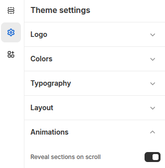
The Animations settings control how sections appear as customers browse your store.
Reveal sections on scroll: When enabled, sections are gradually revealed as the customer scrolls down the page, adding a smooth and modern visual effect
This setting helps enhance the browsing experience by making the store feel more dynamic and engaging.
Buttons
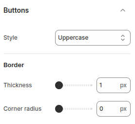
The Button settings allow you to customize the appearance of buttons across your store.
- Style: Controls how button text is displayed. Options include Default, Capitalize, and Uppercase.
- Border thickness: Sets the width of the button border when using outline-style buttons.
- Corner radius – Adjusts the roundness of button corners, from sharp square edges (0px) to fully rounded shapes.
These settings help you align button styles with your brand’s visual identity and improve the overall user experience.
Inputs
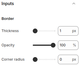
The Input settings let you customize the appearance of form fields such as text boxes and multi-line text
- Border thickness: Controls the width of the input field borders (px).
- Opacity: Adjusts the transparency level of the input borders (%), from fully solid to partially
- Corner radius: Sets the roundness of input field corners, from sharp edges (0 px) to fully rounded styles.
These settings help you match form elements to your store’s overall design style and improve visual consistency.
Product cards
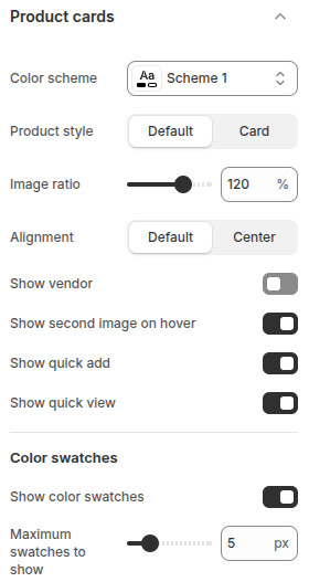
The Product cards settings allow you to customize how products are displayed
- Color scheme: Select the color scheme applied to product cards for consistent styling.
- Product style: Choose between Default or Card layout to control the card’s appearance.
- Image ratio: Adjust the product image ratio (%) to control how images are cropped and displayed.
- Alignment: Set product information alignment (Default or Center).
- Show vendor: Toggle to display or hide the product vendor/brand.
- Show second image on hover: Enable to display the product’s secondary image when customers hover over the product.
- Show quick add: Add an “Add to cart” button directly on the product card for faster shopping.
- Show quick view: Enable a pop-up quick view option so customers can see product details without leaving the page.
- Show color swatches: Display product color variants as swatches on the product.
- Maximum swatches to show: Limit the number of color swatches displayed
Quick view
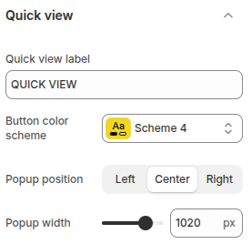
Quick view allows customers to preview product details without navigating to the product page
- Quick view label: Set the text label for the quick view button.
- Button color scheme: Choose the color scheme for the quick view button to match your theme design.
- Popup position: Define where the quick view popup appears on the screen: Left, Center, or Right.
- Popup width – Adjust the width of the quick view popup (px).
Dropdowns and pop-ups
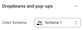
Dropdowns and pop-ups allow you to configure the appearance of dropdown menus and popup elements across the website.
- Color scheme: Select a predefined color scheme to apply consistent styling to dropdown menus and pop-up windows, ensuring they align with the overall store design.
Badges
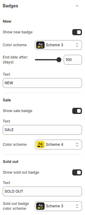
The Badges settings allow you to configure product labels such as New, Sale, and Sold out, helping highlight product status and promotions on product cards.
New Badge
- Show new badge: Toggle on/off to display a “New” badge on recently added products.
- Color scheme: Choose a color scheme for the badge to match your store design.
- End date after (days): Define how many days after publishing a product should be marked as “New.”
- Text: Customize the label text (default: NEW).
Sale Badge
- Show sale badge: Toggle on/off to display a “Sale” badge on discounted products.
- Text: Customize the label text (default: SALE).
- Color scheme: Choose a color scheme for the sale badge.
Sold Out Badge
- Show sold out badge: Toggle on/off to display a “Sold out” badge on unavailable products.
- Text: Customize the label text (default: SOLD OUT).
- Sold out badge color scheme: Choose a color scheme for the sold-out badge.
Social media
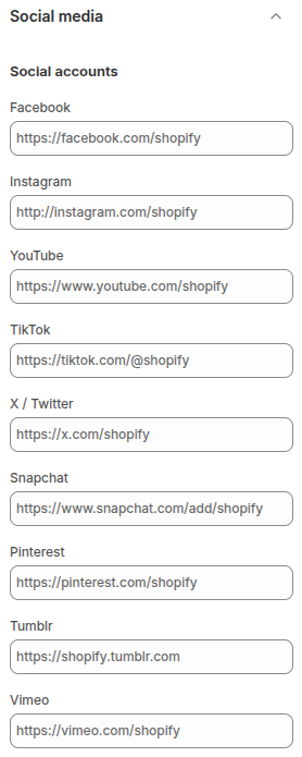
The Social media settings allow you to connect your store with various social platforms. By entering the URLs of your social profiles (such as Facebook, Instagram, YouTube, TikTok, X/Twitter, Snapchat, Pinterest, Tumblr, or Vimeo), customers can easily access and follow your official pages directly from your store.
This feature helps customers stay updated with your latest products, featured collections, and discount policies directly through your social media channels.
Search behavior
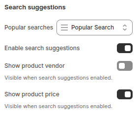
The Search suggestions settings improve the shopping experience by showing customers relevant results as they type in the search bar. You can enable or disable suggestions, display popular searches, and choose to show additional details such as vendor names or product prices directly in the dropdown.
- Popular searches: Choose to display commonly searched terms to help guide customers toward trending or frequently viewed products.
- Enable search suggestions: Activates real-time search suggestions as customers type, making it easier to find relevant products.
- Show product vendor: When enabled, the vendor/brand name of products will be displayed in the suggestions (only visible if search suggestions are active).
- Show product price: When enabled, the product price will appear alongside search suggestions (only visible if search suggestions are active).
Currency format
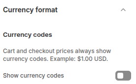
The Currency format setting controls how prices are displayed across your store.
- Show currency codes: When enabled, currency codes (e.g., USD, EUR) will be shown alongside prices in most areas of your store, including product pages, collections, cart, and checkout. This helps provide clarity for customers, especially in international stores.
Cart
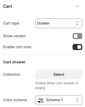
The Cart settings allow you to control how the shopping cart is displayed and what information is shown to customers. These configurations help enhance the shopping experience by providing flexibility in cart presentation and content.
Cart type: Defines how the cart is displayed to customers. Options include:
- Drawer: Opens a sliding panel on the side of the page for quick access to cart items.
- Page: Redirects customers to a dedicated cart page.
- Popup notification: Shows a small popup confirmation when an item is added to the cart.
Show vendor: Toggle to display or hide the product vendor name within the cart.
Enable cart note: Allows customers to leave a note with their order (e.g., special requests or delivery instructions).
Cart Drawer
These settings apply when the cart type is set to Drawer:
Collection: Select a collection to display when the cart drawer is empty, encouraging customers to continue shopping.
Color scheme: Choose a color scheme for the cart drawer to match your store’s branding.
Gift card
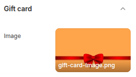
The Gift Card setting allows you to customize the image that appears on your store’s gift cards. This helps create a more branded and visually appealing experience for customers who purchase or receive gift cards.
- Image: Upload a custom image to be displayed on the gift card. This can be a seasonal design, your brand logo, or any graphic that matches your store’s style.
Newsletter popup
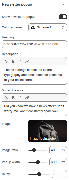
The Newsletter Popup setting allows you to display a promotional popup encouraging visitors to subscribe to your store’s newsletter. It helps capture leads, build your email list, and promote offers effectively.
- Show newsletter popup: Enable or disable the newsletter popup.
- Color scheme: Choose a color scheme to match your store’s branding.
- Heading: Provide a highlighted heading to reinforce your offer.
- Description: Add a detailed description to explain the benefits of subscribing.
- Subscribe note: Include an additional note to reassure customers (e.g., We won’t spam you).
- Image: Upload a custom image that will appear in the popup.
- Image ratio: Adjust the image ratio to control its display size in the popup.
- Popup width: Set the width of the popup window in pixels.
- Delay: Define the delay (in seconds) before the popup appears after a visitor lands on your store.
Back to top
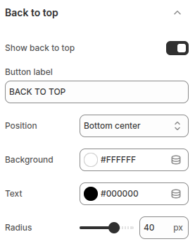
The Back to top settings allow you to configure a button that helps users quickly scroll back to the top of the page, improving navigation and usability.
- Show back to top: Toggle to enable or disable the “Back to Top” button.
- Button label: Define the text that appears on the button (e.g., “BACK TO TOP”).
- Position: Choose where the button will be displayed on the page.
- Background: Set the background color of the button to match your store’s branding.
- Text: Choose the text color for the button label.
- Radius: Adjust the roundness of the button’s corners (in pixels).
Instant page
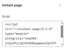
The Instant Page setting allows you to enable just-in-time preloading for faster navigation across your store. By adding the instant.page script, links are intelligently preloaded when users hover over or touch them, making page transitions feel nearly instant.
- Script: Here, you must paste the script snippet provided by instant.page. The script uses the
integrityattribute for security and is responsible for enabling preloading.
When enabled, customers will experience smoother and quicker browsing, as pages begin loading in the background right before they are clicked.
Custom CSS
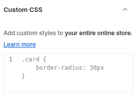
The Custom CSS setting allows store owners to add their own CSS rules to the theme, applying custom styles across the entire online store. This provides flexibility to fine-tune design elements without modifying the theme’s core files.
Sections
Sections are the building blocks of the Classique Shopify Theme, giving merchants the flexibility to design and structure their storefront without coding knowledge. Each section can be added, removed, and rearranged to create a unique shopping experience that matches your brand.
While each section comes with its own configuration settings, they also inherit styles and rules from the global theme settings (such as typography, colors, and layout). This balance between global consistency and local flexibility makes Theme Shopify Classique both powerful and easy to customize.
General
In the Classique Shopify Theme, most sections share a common structure. Each section is divided into several parts:
- Section header: The top area of the section, displaying the heading, description, and optional button. The button can be positioned either at the top or bottom of the section depending on the settings.
- Section body: The main content area containing all feature-related configurations. Each section will have different options here depending on its functionality.
- Section design: Settings for colors and background customization of the section.
- Section padding: Controls the spacing inside the section, specifically the top and bottom padding.
- Section margin: Adjusts the distance between the current section and the sections above it.
- Section layout: Determines the overall layout of the section, such as full width or a fixed content width.
This structured approach provides consistency across sections while allowing flexibility for unique designs and features.
The settings described above are the universal configurations applied to most sections in the Classique theme. When moving on to the detailed documentation of each individual section, we will focus only on the unique features of that section and will not repeat these common configurations.
Section header
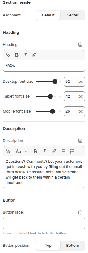
The Section Header provides the introductory content for each section, including the heading, description, and optional button. It helps communicate the purpose of the section and guide users’ interactions.
- Alignment: Choose between Default or Center alignment for the header content.
- Heading: Define the section title. You can also adjust font sizes individually for desktop, tablet, and mobile devices.
- Description: Add supporting text beneath the heading. This is typically used to provide more context or instructions for the section.
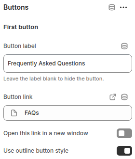
Buttons
The Button setting allows you to add an optional call-to-action (CTA) button within the section header. It is useful for directing customers to another page, collection, or feature.
- Button label: Enter the text displayed on the button. Leaving this field blank will hide the button.
- Button position: Choose where the button should appear in the section: Top or Bottom.
- Button link: Specify the link (URL or internal resource) that the button directs to.
- Open this link in a new window: Enable this option if you want the button link to open in a new browser tab/window.
- Use outline button style: Toggle this to display the button in an outline style instead of the default solid style, giving a lighter visual emphasis.
Section design
The Section design settings allow you to control the overall look and feel of the section, focusing on background and color styling.
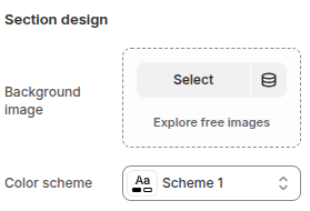
- Background image – Upload or select an image to be used as the section’s background. This helps create a more visually engaging layout.
- Color scheme – Choose a predefined color scheme to apply to the section. This ensures consistent use of colors across text, buttons, and backgrounds in alignment with the store’s design system.
Section padding
The Section padding settings control the vertical spacing (top and bottom) inside the section, allowing you to adjust how much space surrounds the content.
This configuration helps maintain a clean and balanced layout, preventing sections from appearing too cramped or too spread out, while keeping the design responsive on all devices.
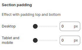
Desktop: Define the padding (in pixels) for the top and bottom of the section when viewed on desktop devices.
Tablet and mobile: Set custom padding values for tablets and mobile devices to ensure optimal spacing and readability across different screen sizes.
Section margin
The Section margin settings control the spacing above the section, helping you adjust the distance between this section and the one placed before it.
This configuration ensures smooth separation between sections, improving readability and visual balance on different devices.
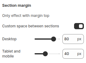
- Custom space between sections: Enable this option to manually set the spacing between sections.
- Desktop: Define the margin-top value (in pixels) for desktop devices.
- Tablet and mobile: Set specific margin-top values for tablet and mobile devices to maintain a consistent layout across screen sizes.
Section layout
The Section layout settings define how the section is displayed in relation to the page width and how its content is aligned. These options help you create flexible and well-structured layouts suitable for different design needs.
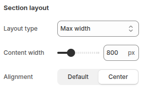
Layout type: Choose how the section spans across the page:
- Full with no padding: The section stretches the full width of the screen without left or right padding.
- Full with padding: The section takes up the full width but includes left and right padding for balanced spacing.
- Max width: The section has a fixed maximum width, ideal for content-focused layouts.
Content width: Select the width for the content inside the section. This option is only available when the layout type is set to Max width.
Alignment: Adjust the horizontal alignment of the content with two options:
- Default: Uses the theme’s standard alignment.
- Center: Centers the content within the section.
Custom CSS
The Custom CSS option allows you to apply additional styling specifically to the current section. Unlike global custom CSS (which affects the entire store), any code added here will only modify the appearance and behavior of this particular section.
This feature is useful when you want to:
- Add unique design tweaks without changing other sections.
- Override default theme styles for the current section.
- Apply advanced customizations such as animations, borders, or typography adjustments.
By limiting the scope of the CSS to this section, you can experiment with custom styles safely without impacting the overall layout of your store.
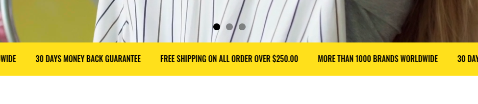
Announcement bar
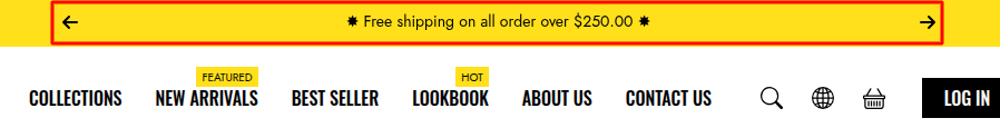
The Announcement Bar section is designed to highlight short, important messages such as promotions, discounts, or return policies. Positioned at the header, it ensures visitors can quickly grasp key information right when they enter the site.
Scope
Displays only in the header, making important messages immediately visible to visitors as they browse the site.
Section Settings
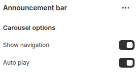
- Show Navigation: Enables Next and Previous buttons, allowing users to easily navigate between slides.
- Auto Play: Configures the slider to run automatically. Auto-play makes the website feel more dynamic and engaging, while ensuring visitors can view all messages without manually clicking navigation buttons.
Section Block Settings
Block: Item
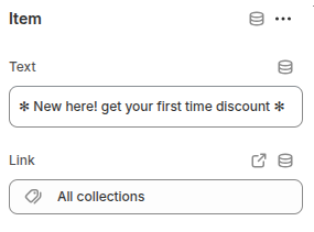
The Item block is used to configure the content of each slide in the Announcement Bar carousel
- Text: Enter the message or content of the slide, such as promotions, discounts.
- Link: Add an optional URL so visitors can click for more details.
Header
The Header Section contains the main elements of the website header, including the logo, navigation menu, search bar, user account, and shopping cart. It provides visitors with essential tools for browsing and interacting with the site.
Scope
Represents the main header area of the website, visible across all pages. It contains the key elements for site navigation and user interaction.
Settings
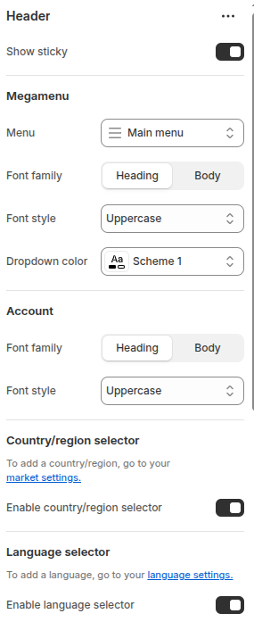
The Header section controls the main navigation and utility features of your store’s.
- Show sticky: Enable this option to keep the header visible at the top of the page while scrolling.
Megamenu
- Menu: Select the main menu to be displayed in the header navigation.
- Font family: Choose whether the menu items use the Heading or Body font style.
- Font style: Select the text transformation style for menu items (e.g., Uppercase).
- Dropdown color: Choose the color scheme for dropdown menus.
Account
- Font family: Choose the font style (Heading or Body) for account-related text such as Login or Register.
- Font style: Select the text transformation style (e.g., Uppercase).
Country/region selector
- Enable country/region selector: Toggle this option to show or hide the selector for switching between countries or regions.
Language selector
- Enable language selector: Toggle this option to display a language selector for multi-language stores.
Blocks
The dropdown megamenu is structured using a 12-column grid layout, allowing flexible arrangement of content within the menu.
Each block inside the header section represents an individual component within the dropdown menu.
You should rename the blocks to easily identify which dropdown each block belongs to.
All blocks share the following common configurations:
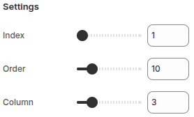
- Index: Determines which Menu item (level 1) this block belongs to.
- Order: Controls the display order of this block relative to other blocks within the same dropdown.
- Column: Defines the number of grid columns (out of 12) that the block occupies in the layout.
Block: Menu setting
This block is part of the megamenu layout within the Header section and is used to configure the dropdown settings for a specific top-level menu item.
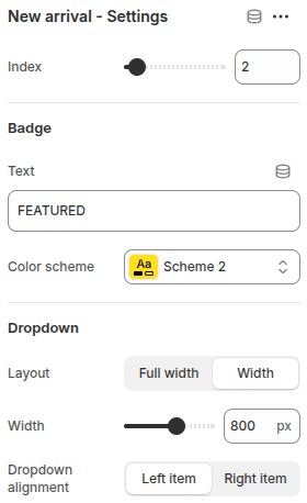
- Index: Defines which top-level menu item this dropdown belongs to. For example, an index value of 2 links this block to the second menu item in the main navigation.
Badge
- Text: Add a short label (e.g., “FEATURED”) that appears next to the menu item to highlight it.
- Color scheme: Select a color scheme for the badge to match your store’s branding or highlight color.
Dropdown
- Layout: Choose how the dropdown menu appears.
Full width: The dropdown spans the full width of the header.
Width: Allows you to specify a custom width for the dropdown. - Width: When the “Width” layout is selected, you can manually set the dropdown width in pixels.
- Dropdown alignment: Choose whether the dropdown aligns to the Left item or Right item of the corresponding menu.
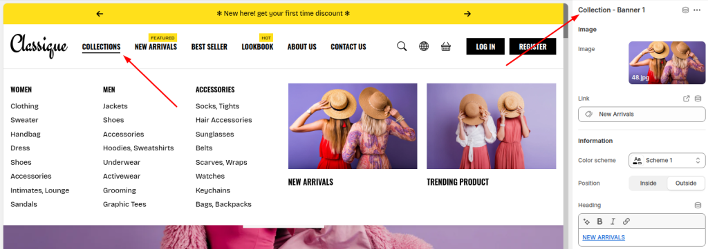
Block: Menu category
This block is used to display a list of collections and their subcategories inside the dropdown megamenu.
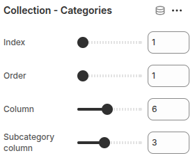
- Index: Determines which top-level menu item (level 1) this block belongs to.
- Order: Defines the display order of this block among other blocks inside the same dropdown.
- Column: Specifies the number of columns this block occupies in the 12-column megamenu grid layout.
- Subcategory column: Sets the number of columns used to display subcategories within the block.
Block: Menu banner
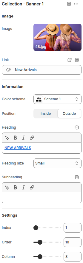
This block displays a promotional image banner inside the dropdown megamenu.
It is commonly used to highlight featured collections, promotions, or new arrivals.
- Image: Upload an image to display inside the banner.
- Link: Set a link for the banner. When clicked, users will be redirected to the assigned page or collection.
- Color scheme: Choose a color scheme for the banner.
- Position: Determine whether the banner’s content (heading and subheading) appears inside or outside the image.
- Heading: Add a main title for the banner, such as a collection name or promotion label.
- Heading size: Select the size of the heading text.
- Subheading: Optionally add a short description or tagline under the main heading.
- Index: Identify which top-level menu item this banner belongs to.
- Order: Define the display order of this banner relative to other blocks within the same dropdown.
- Column: Specify how many columns (out of 12) this banner occupies in the megamenu grid.
Cover
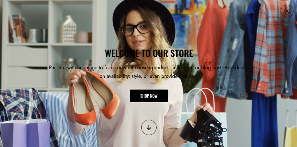
The Cover section is a fullscreen banner designed to capture visitors’ attention immediately upon entering the website. It is often used to showcase discount campaigns, highlight new products, or introduce featured collections.
Scope
- Available only on the Home page.
- Can be placed exclusively within the Header area.
- Displays in fullscreen mode, ensuring it is the very first element customers see when landing on the site.
Settings
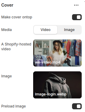
Make Cover On Top: When enabled, the cover will display as a fullscreen overlay on the website.
Media: Choose the type of media for the cover.
- Video: Upload a Shopify-hosted video to create a dynamic, engaging background.
- Image: Upload an image for a static but impactful background.
Preload Image: Toggle to preload the image, ensuring faster display and a smoother user experience.
Slideshow
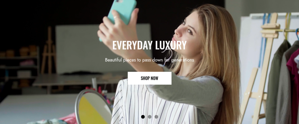
The Slideshow section allows merchants to showcase multiple banners in a dynamic carousel format. It is ideal for highlighting promotions, featured products, or storytelling content through engaging visuals.
Scope
Displayed in the Main area of all pages.
Settings
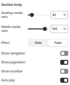
Desktop Media Ratio: Adjusts the display ratio of media (image/video) on desktop devices for optimal layout.
Mobile Media Ratio: Adjusts the display ratio of media on mobile devices to ensure responsive design.
Effect: Choose the transition style between slides.
- Slide: A smooth horizontal sliding transition.
- Fade: A crossfade effect for a softer transition.
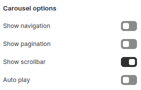
Show Navigation: Displays “Next” and “Previous” arrows to manually switch between slides.
Show Pagination: Displays pagination dots that represent each slide, allowing quick navigation.
Show Scrollbar: Displays a horizontal scrollbar for slide navigation.
Auto Play: Enables automatic slide rotation, enhancing engagement without requiring user interaction.
Blocks
Block: Item
Block Item is used to configure the content of each slide in the slideshow. Merchants can customize visuals, text, and call-to-action buttons to create engaging banners.
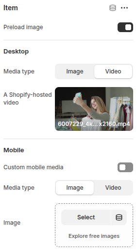
Preload Image: Preloads the slide image for faster display.
Desktop
- Media Type: Choose between Image or Video (Shopify-hosted video supported).
- Image/Video Upload: Upload media that will display on desktop devices.
Mobile
- Custom Mobile Media: Option to set different media for mobile view.
- Media Type: Choose between Image or Video for mobile.
- Image/Video Upload: Upload media optimized for mobile devices.
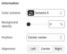
- Color Scheme: Select a predefined color scheme for text and elements.
- Background Opacity: Adjust background transparency behind text.
- Position: Choose where the content (text + button) will be displayed on the slide.
- Alignment: Align text left, center, or right within the content box.
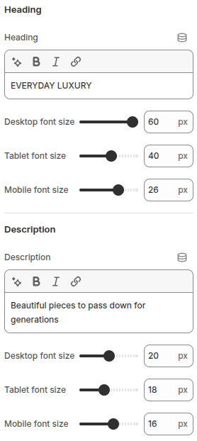
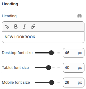
Heading
- Heading Text: Main title displayed on the slide.
- Desktop Font Size: Adjust heading size on desktop.
- Tablet Font Size: Adjust heading size on tablet.
- Mobile Font Size: Adjust heading size on mobile.
Description
- Description: Supporting text below the heading.
- Desktop Font Size: Adjust description size on desktop.
- Tablet Font Size: Adjust description size on tablet.
- Mobile Font Size: Adjust description size on mobile.
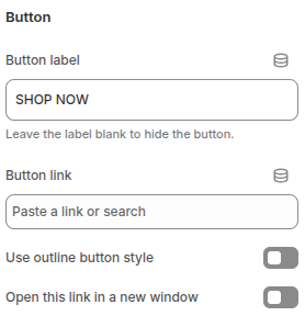
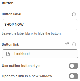
Button
- Button Label: Text displayed on the call-to-action button.
- Button Link: Add a URL or internal link for the button.
- Outline Button Style: Option to use an outlined button design.
- Open Link in New Window: Opens the link in a new browser tab/window.
Marquee text
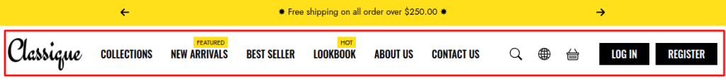
The Marquee Text section is designed to display short, eye-catching messages in a continuously scrolling format. It is often used to highlight promotions, shipping policies, or brand values in a way that immediately grabs customer attention.
Scope
- Can be displayed in the Header, Main, or Footer areas.
- Available across all pages.
Settings
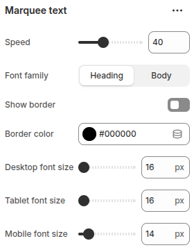
- Speed: Adjusts the scrolling speed of the marquee text. A higher value makes the text move faster across the screen.
- Font Family: Choose whether the marquee text uses the Heading font style or the Body font style defined in the theme.
- Show Border: Toggle to enable or disable a border around the marquee text area.
- Border Color: Select the border color when the border is enabled.
- Desktop Font Size: Adjust the text size specifically for desktop devices.
- Tablet Font Size: Adjust the text size specifically for tablets.
- Mobile Font Size: Adjust the text size specifically for mobile devices.
Blocks
Block: Item
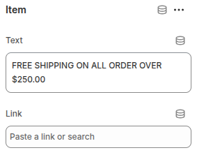
Block Item is used to configure each individual message displayed in the marquee.
- Text: Enter the short message to display (e.g., “Free shipping on all orders over $250”).
- Link: Optionally add a URL or internal link. When provided, the text becomes clickable, allowing customers to navigate directly to the related page or promotion.
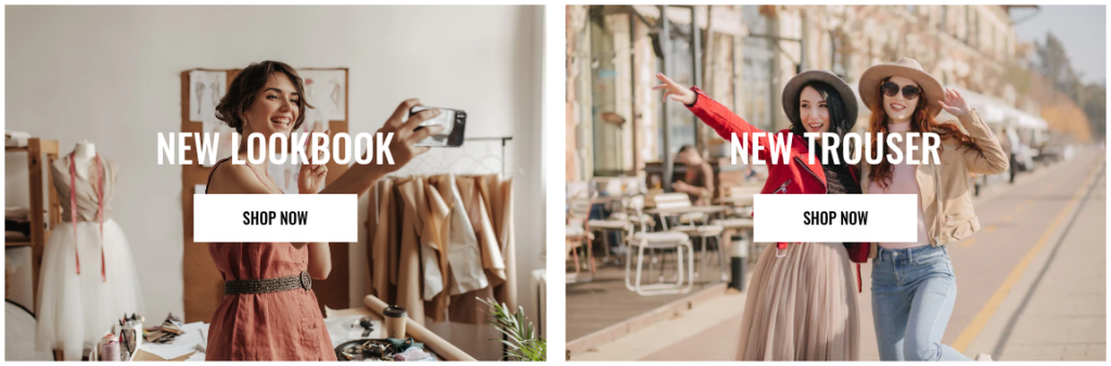
Image banner
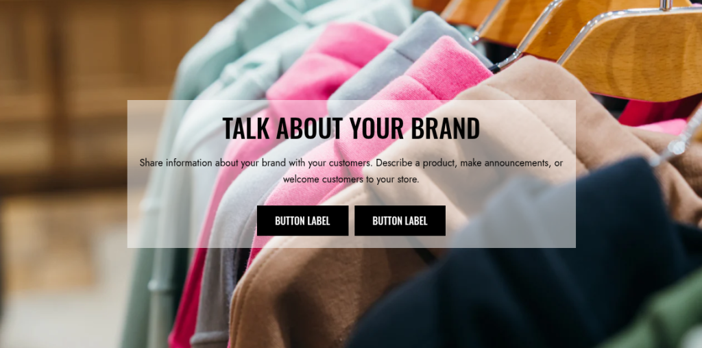
The Image Banner section is designed to highlight key visuals such as promotions, product highlights, or collection introductions. It allows merchants to display impactful images with customizable layout and overlay options, making it a versatile section for storytelling and branding.
Scope
Can be displayed in the Main area of all pages.
Settings
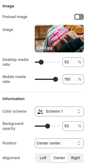
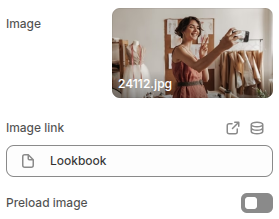
Image
- Preload Image: Preloads the banner image to ensure faster loading and smoother user experience.
- Image: Upload an image to be displayed in the banner.
- Desktop Media Ratio: Adjusts the display ratio of the image on desktop devices.
- Mobile Media Ratio: Adjusts the display ratio of the image on mobile devices for responsive design.
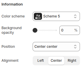
Information
- Color Scheme: Choose a color scheme for text and overlays to match branding.
- Background Opacity: Adjust the transparency of the background overlay behind text for better readability.
- Position: Define the position of the content (e.g., Center Center).
- Alignment: Align the text content within the banner (Left, Center, or Right).
Blocks
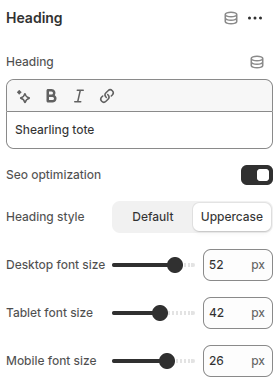
Block: Heading
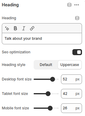
- Heading: Enter the heading text.
- SEO Optimization(Disabled): Heading will use the
<h1>tag. - SEO Optimization(Enabled): Heading will use the
<h2>tag, ensuring better SEO structure and avoiding duplicate<h1>tags. - Heading Style: Choose between Default or Uppercase text.
- Desktop Font Size: Adjust the heading size for desktop displays.
- Tablet Font Size: Adjust the heading size for tablet screens.
- Mobile Font Size: Adjust the heading size for mobile devices.
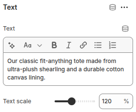
Block: Text
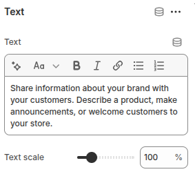
- Text: Enter the text content to be displayed.
- Text Scale: Adjust the overall size of the text proportionally by percentage, ensuring readability across devices.
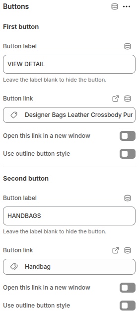
Block: Buttons
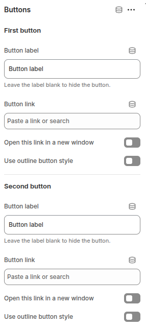
The Buttons block allows you to add up to two call-to-action buttons on the Image Banner, directing customers to important pages such as products, collections, or promotions.
Each button includes the following options:
- Button Label: Enter the text to display on the button. Leave blank to hide the button.
- Button Link: Define the URL or page the button links to.
- Open in New Window: Enable to open the link in a new browser tab.
- Use Outline Button Style: Enable to display the button in an outline style instead of a filled design.
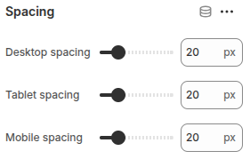
Block: Spacing
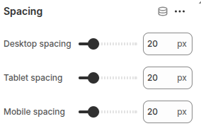
The Spacing block is used to create vertical spacing between blocks within the Image Banner, helping improve readability and layout balance.
- Desktop Spacing: Adjust the amount of spacing (in pixels) displayed on desktop devices.
- Tablet Spacing: Adjust the spacing specifically for tablet devices.
- Mobile Spacing: Adjust the spacing for mobile devices to ensure proper layout across all screen sizes.
Image with text
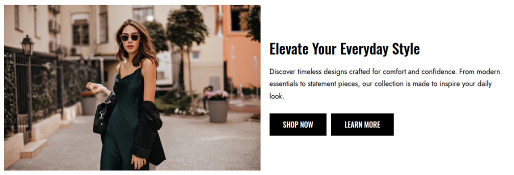
The Image with text section allows you to combine a featured image with customizable text content side by side. This layout is ideal for highlighting products, promotions, or brand messages in a visually engaging way.
You can display an image on one side and add a heading, subheading, and descriptive text on the other. The section also supports call-to-action buttons, enabling you to guide customers directly to product pages, collections, or other parts of your store.
This section is perfect for showcasing key visuals while delivering compelling content to inspire customers and drive engagement.
Scope
Can be displayed in the Main area of all pages.
Settings
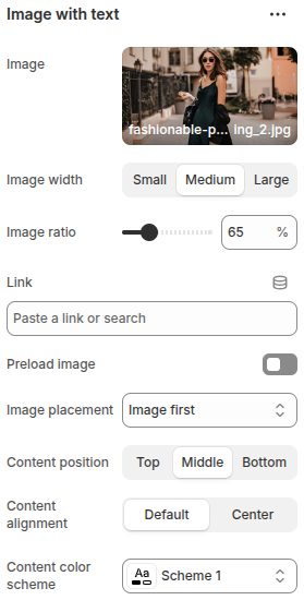
The Image with text section includes the following configuration options:
- Image: Upload or select an image to display in the section.
- Image width: Choose the size of the image with options Small, Medium, or Large.
- Image ratio: Adjust the product image ratio (%) to control how images are cropped and displayed.
- Link: Add a link to make the image clickable, directing users to a specific page or URL.
- Preload image: Toggle on to preload the image for better performance..
- Image placement: Decide the order of content by choosing Image first or text first.
- Content position: Set the vertical alignment of the content with options Top, Middle, or Bottom.
- Content alignment: Align the text content as Default (left) or Center.
- Content color scheme: Select a color scheme for the text content to match your store’s design.
Blocks
Block: Heading
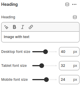
- Heading: Enter the text to be displayed as the heading.
- Desktop font Size: Adjust the heading size for desktop displays.
- Tablet font Size: Adjust the heading size for tablet screens.
- Mobile font Size: Adjust the heading size for mobile devices.
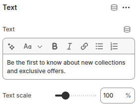
Block: Text
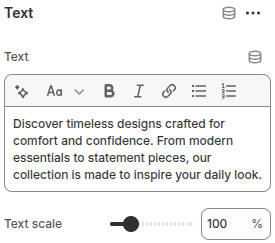
- Text: Enter the text content to be displayed.
- Text Scale: Adjust the overall size of the text proportionally by percentage, ensuring readability across devices.
Block: Buttons
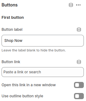
Each button includes the following options:
- Button Label: Enter the text to display on the button. Leave blank to hide the button.
- Button Link: Define the URL or page the button links to.
- Open in New Window: Enable to open the link in a new browser tab.
- Use outline button style: Enable to display the button in outline style.
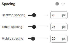
Block: Spacing
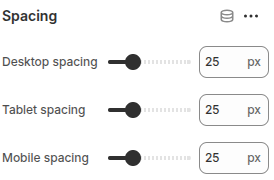
The Spacing block is used to create vertical spacing between blocks within the Image Banner, helping improve readability and layout balance.
- Desktop Spacing: Adjust the amount of spacing (in pixels) displayed on desktop devices.
- Tablet Spacing: Adjust the spacing specifically for tablet devices.
- Mobile Spacing: Adjust the spacing for mobile devices to ensure proper layout across all screen sizes.
Featured product
The Featured product section highlights a specific product on your store. It allows merchants to showcase a single product with detailed information, such as product image, title, price, description, and purchasing options.
This section is useful for promoting best-sellers, new arrivals, or seasonal items directly on the homepage or landing pages, giving customers quick access to featured products and encouraging conversions.
Scope
Can be displayed in the Main area of all pages.
Settings
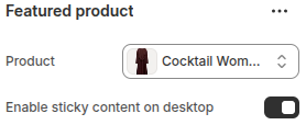
- Product: Select the product to be featured in this section.
- Enable sticky content on desktop: Keeps the product details fixed on screen while scrolling on desktop devices, ensuring better visibility and accessibility.
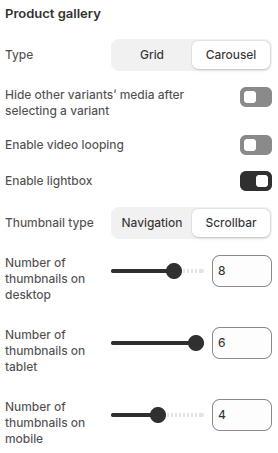
- Type: Choose between Grid or Carousel layout for displaying product media.
- Hide other variants’ media after selecting a variant: When enabled, only the media related to the selected variant is shown.
- Enable video looping: Allows videos in the gallery to play continuously in a loop.
- Enable lightbox: Opens product images in a larger, focused view when clicked.
- Thumbnail type: Choose between Navigation or Scrollbar styles for thumbnails.Number of thumbnails on desktop: Set how many thumbnails are visible on desktop devices.
- Number of thumbnails on tablet: Set how many thumbnails are visible on tablet devices.
- Number of thumbnails on mobile: Set how many thumbnails are visible on mobile devices.
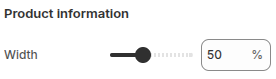
Width: Adjusts the width percentage of the product information area within the section layout.
Blocks
Block: Title
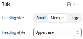
The block Title displays the product title. It includes the following settings:
- Heading size: Choose the size of the heading text (Small, Medium, or Large).
- Heading style: Select the text style for the heading, such as Uppercase.
Block: Price
The Price block simply displays the price of the product. It does not include any additional configuration options.
Block: Variant picker
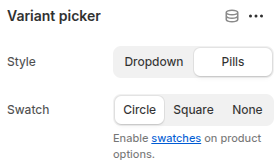
- Style: Choose how variant options are displayed:
Dropdown: Shows variant options in a dropdown menu.
Pills: Displays variant options as clickable pill-shaped buttons. - Swatch: Choose how swatches are displayed for product options (commonly used for colors or patterns):
Circle: Displays swatches in a circular shape.
Square: Displays swatches in a square shape.
None: Disables swatches, showing only text-based options.
Block: Quantity selector
The Quantity Selector block allows customers to choose the number of product units they want to purchase. This block provides an input option for adjusting product quantity before adding it to the cart.
Block: Buy buttons
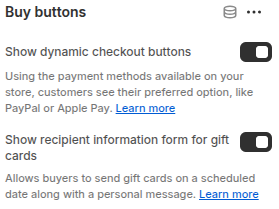
The Buy Buttons block displays purchase options for the product. It includes two configurations:
- Show dynamic checkout buttons: Allows customers to see and use their preferred payment methods (e.g., PayPal, Apple Pay) for faster checkout.
- Show recipient information form for gift cards: Lets buyers enter recipient details when purchasing gift cards, including scheduling delivery dates and adding personal messages.
Block: SKU
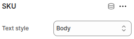
The SKU block is used to display the product’s Stock Keeping Unit (SKU).
- Text style: Allows choosing the display style of the SKU, such as Body text style for consistent formatting with product details.
Block: Collapsible row
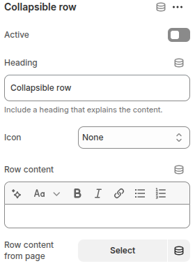
- Active: If enabled, the row content will be expanded and displayed by default when the page loads.
- Text for the row title that customers click to expand/collapse.
- Icon: Select an icon to display next to the heading.
- Row content: Enter custom text content to display inside the collapsible row.
- Row content from page: Choose an existing page from your store to display its content within the row.
This block is useful for organizing detailed information in a clean, user-friendly way.
Block: Text
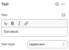
The Text block is a simple block that displays a custom text string.
- Text: Field to enter the text content.
- Text style: Allows you to choose how the text is displayed, with options Default, Capitalize, or Uppercase.
Block: Description
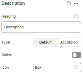
The Description block displays the product’s description and provides several customization options
- Heading: Set a custom heading for the description block (default is “Description”).
- Type: Choose how the description is displayed:
Default: Shows the full description as plain content.
Accordion: Displays the description in a collapsible accordion format. - Active: Toggle to make the accordion expanded by default when the page loads (only applies if Accordion type is selected).
- Icon: Choose the icon style (e.g., Box) that appears alongside the accordion heading.
This block helps present product details in either a straightforward or space-saving accordion style, improving the browsing experience.
Block: Inventory status
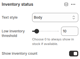
Block Inventory status displays the stock availability of a product. It includes the following settings:
- Text style: Choose the text style for displaying the inventory status (e.g., Body).
- Low inventory threshold: Set a threshold value (e.g., 10). When the stock falls below this number, a low inventory warning will be shown. Setting it to 0 will always display “in stock” as long as the product is available.
- Show inventory count: Enable or disable the option to display the exact inventory quantity.
This block helps communicate product availability clearly and can create urgency by showing low stock levels.
Block: Product rating
The Product rating block displays the rating of a product. However, it requires a related Product Rating app to be installed and configured in order to function.
Once the app is connected, this block will show the average rating and review stars for the product, helping customers evaluate product quality and make purchase decisions more confidently.
Block: Pop-up
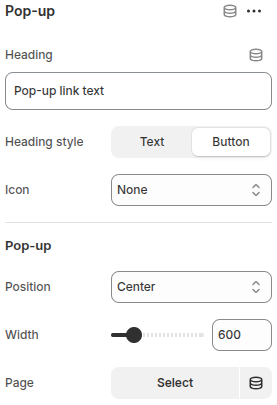
The Pop-up block allows you to display additional information in a pop-up window when customers click on a link or button.
- Heading: Text for the pop-up link (e.g., “More info”).
- Heading style: Choose whether the link appears as simple text or a button.
- Icon: Option to display an icon next to the link/button.
- Pop-up Position: Set the pop-up’s display position (e.g., Center).
- Width: Adjust the width of the pop-up window.
- Page: Select a specific page from your store to display inside the pop-up.
This block is useful for showing extra details (such as shipping info, size guides, or policies) without cluttering the product page.
Block: Complementary products
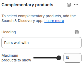
Block Complementary products allows you to display products that pair well with the main product, encouraging upsells and cross-sells. It includes the following settings:
- Heading: Customize the heading text shown above the complementary products (e.g., “Pairs well with”).
- Maximum products to show: Define the maximum number of complementary products to display.
To use this block, you need to install and configure the Search & Discovery app, which enables selecting and managing complementary product recommendations.
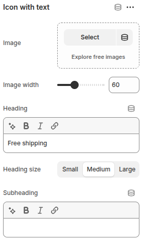
Block: Icon with text
Featured collection
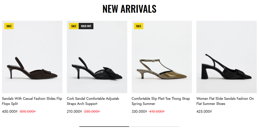
The Featured Collection section is designed to showcase a selected product collection on your store’s homepage or landing pages. It helps highlight best-selling, seasonal, or promotional products to attract customer attention and boost conversions.
Scope
Can be displayed in the Main area of all pages.
Settings
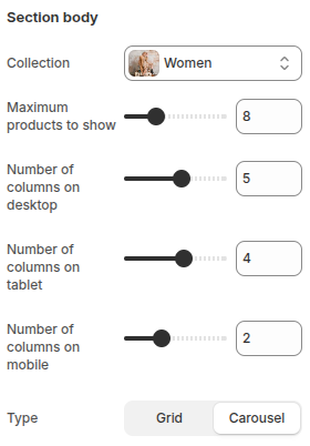
- Collection: Select which product collection to display in this section. This allows you to feature specific product groups such as “New Arrivals,” “Best Sellers,” or seasonal items.
- Maximum products to show: Set the maximum number of products that will be displayed from the selected collection.
- Number of columns on desktop: Define how many product columns are displayed on desktop devices.
- Number of columns on tablet: Define how many product columns are displayed on tablet devices.
- Number of columns on mobile: Define how many product columns are displayed on mobile devices.
- Type:
Grid: Products are arranged in a fixed grid layout.
Carousel: Products are shown in a horizontal slider, allowing users to scroll through items.
- Show navigation: Enable or disable navigation arrows, allowing customers to manually scroll through the products.
- Show pagination: Display pagination indicators (such as dots) to show the number of slides and the current active slide.
- Show scrollbar: Add a horizontal scrollbar for quick navigation through the carousel.
- Auto play: Automatically rotate the carousel slides without user interaction.
Group banner
The Group Banner section is designed to display multiple banners within a single layout, allowing you to showcase collections, products, promotions, or custom content in a visually engaging way. It is useful for highlighting different categories or campaigns at once, helping customers quickly navigate to the areas of the store that interest them most.
This section supports multiple banner blocks, giving you flexibility to combine images, headings, text, and links in a grid-like structure. It’s ideal for homepage use, seasonal promotions, or highlighting featured product ranges.
Scope
Can be displayed in the Main area of all pages.
Settings

- Remove grid spacing: Toggle to remove spacing between banners, creating a seamless layout.
- Image ratio: Adjust the product image ratio (%) to control how images are cropped and displayed.
- Number of columns on desktop: Set the number of banner columns displayed on desktop devices.
- Number of columns on tablet: Set the number of banner columns displayed on tablet devices.
- Number of columns on mobile: Set the number of banner columns displayed on mobile devices.
Blocks
Each Block Item has the following configurations:
- Image: Upload an image to display in the banner.
- Image link: Add a link to make the banner image clickable, directing users to a specific page or URL.
- Preload image: Enable to preload the image for faster display.
- Color scheme: Select a color scheme for the banner content.
- Background opacity: Adjust the background overlay transparency (%) for the banner content area.
- Position: Set the position of the content inside the banner.
- Alignment: Choose the text alignment (left, center, right).
- Heading: Enter the title text to display inside the banner.
- Desktop font size: Set the heading font size for desktop screens (px).
- Tablet font size: Set the heading font size for tablet screens (px).
- Mobile font size: Set the heading font size for mobile screens (px).
- Description: Add a short description for the banner.
- Button label: Enter the button text. Leave blank to hide the button.
- Button link: Add a link for the button to direct users to a specific page or URL.
- Use outline button style: Enable to display the button in outline style.
- Open this link in a new window: Enable this option if you want the button link to open in a new browser tab/window.
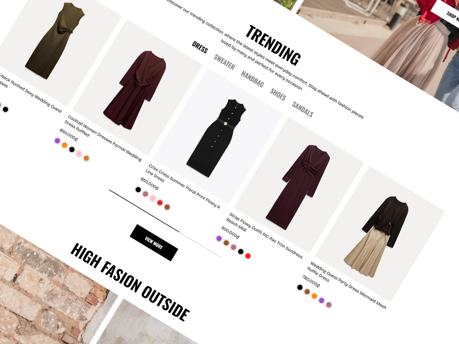
Tab collection
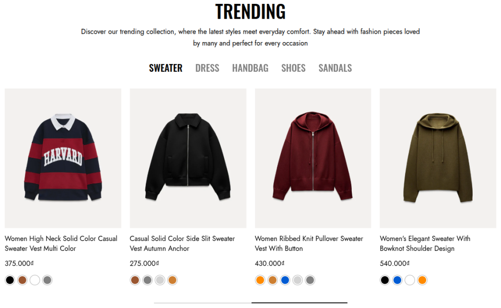
The Tab Collections section allows you to showcase multiple product collections within a single section using a tabbed layout. Customers can easily switch between tabs to explore different collections without leaving the page, improving browsing efficiency and engagement.
This section is especially useful for highlighting related collections (e.g., Men, Women, Accessories), seasonal products, or promotional categories. By organizing collections into tabs, it helps save space on the page while still providing quick access to a variety of product groups.
Scope
Can be displayed in the Main area of all pages.
Settings
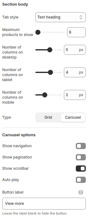
- Tab style: Allows you to choose the display style of the tab title
- Maximum products to show: Sets the maximum number of products displayed in each tab collection.
- Number of columns on desktop: Defines the number of product columns displayed on desktop devices.
- Number of columns on tablet: Defines the number of product columns displayed on tablet devices.
- Number of columns on mobile: Defines the number of product columns displayed on mobile devices.
- Type: Determines how products are displayed:
Grid: Products are shown in a grid layout.
Carousel: Products are displayed in a sliding carousel layout.
Carousel options (only available if Carousel is selected):
- Show navigation: Displays navigation arrows (previous/next) on the carousel.
- Show pagination: Displays pagination dots below the carousel.
- Show scrollbar: Displays a horizontal scrollbar to navigate the carousel.
- Auto play: Enables automatic sliding of products.
- Button label: Sets the label for the action button (e.g., View more). Leaving this field blank will hide the button.
Blocks
Block: Item
Each Block Item has the following configurations:
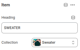
- Heading: Defines the title of the tab. This text will be shown as the clickable label for switching between collections.
- Collection: Allows you to select a Shopify collection that will be displayed when the corresponding tab is active.
Lookbook
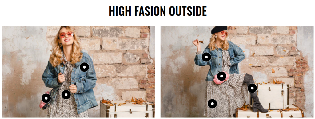
The Lookbook section allows you to showcase lifestyle or fashion photography with interactive product hotspots. Each hotspot can be linked to a product, making it easier for customers to discover and shop items directly from the image.
Scope
Can be displayed in the Main area of all pages.
Settings
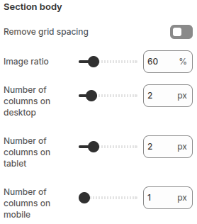
- Remove grid spacing: Toggle to remove spacing between banners, creating a seamless layout.
- Image ratio: Adjust the product image ratio (%) to control how images are cropped and displayed.
- Number of columns on desktop: Set the number of banner columns displayed on desktop devices.
- Number of columns on tablet: Set the number of banner columns displayed on tablet devices.
- Number of columns on mobile: Set the number of banner columns displayed on mobile devices.
Blocks
Each block represents a clickable hotspot placed on the image. The hotspot can be positioned anywhere and linked to a specific product. When customers interact with the hotspot, they can view product details or be redirected to the product page.
Each block in the Lookbook section allows you to upload an image and configure up to 5 product hotspots.
Each Block Item has the following configurations:
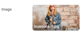
Image: Upload an image to display in the banner.
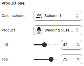
- Color scheme: Choose a color scheme for the hotspot marker to ensure visibility and match the overall design style.
- Product: Select the product that will be linked to this hotspot. When customers click the hotspot, they can view the product details through a quickview popup.
- Left: Adjust the horizontal position of the hotspot on the image by percentage.
- Top: Adjust the vertical position of the hotspot on the image by percentage.
Product two, Product three, Product four, and Product five have the same configuration.
Rich text
The Rich text section is designed to display flexible text-based content anywhere on your store. It’s perfect for sharing brand stories, highlighting key messages, or adding supporting information to engage customers.
Scope
Can be displayed in the Main area of all pages.
Settings
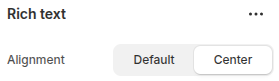
- Alignment: Choose how the text content is aligned within the section.
Default: Uses the theme’s standard text alignment.
Center: Aligns the text content to the center for a more balanced layout.
Blocks
Block: Heading
- Heading: Enter the text you want to display as the section heading.
- SEO Optimization
Disabled: Heading will use the<h1>tag.
Enabled: Heading will use the<h2>tag - Heading style: Choose between Default or Uppercase text.
- Desktop font size: Set the heading font size for desktop screens (px).
- Tablet font size: Set the heading font size for tablet screens (px).
- Mobile font size: Set the heading font size for mobile screens (px).
Block: Text
- Text: Enter the text content to be displayed.
- Text Scale: Adjust the overall size of the text proportionally by percentage, ensuring readability across devices.
Block: Buttons
Each button includes the following options:
- Button Label: Enter the text to display on the button. Leave blank to hide the button.
- Button Link: Define the URL or page the button links to.
- Open in New Window: Enable to open the link in a new browser tab.
- Use outline button style: Enable to display the button in outline style.
Block: Spacing
The Spacing block is used to create vertical spacing between blocks within the Image Banner, helping improve readability and layout balance.
- Desktop Spacing: Adjust the amount of spacing (in pixels) displayed on desktop devices.
- Tablet Spacing: Adjust the spacing specifically for tablet devices.
- Mobile Spacing: Adjust the spacing for mobile devices to ensure proper layout across all screen sizes.
Video
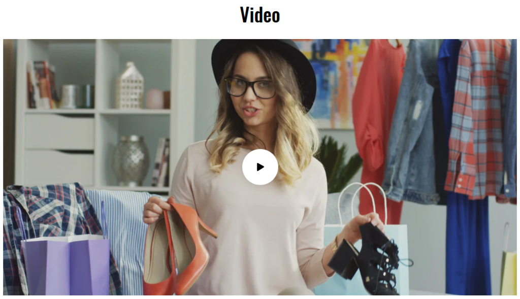
The Video section allows you to showcase engaging video content directly on your store. It’s designed to highlight brand stories, product demonstrations, or marketing campaigns in a visually appealing way, helping to capture customer attention and increase engagement.
You can easily configure this section by uploadSettingsing a video file or embedding a link from platforms like YouTube or Vimeo.
Scope
Can be displayed in the Main area of all pages.
Settings
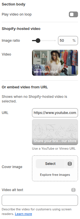
- Play video on loop: Bật/tắt tùy chọn này để video tự động lặp lại sau khi kết thúc.
- Image ratio: Điều chỉnh tỉ lệ hiển thị khung hình của video theo phần trăm.
- Video: Tải lên và chọn video được lưu trữ trực tiếp trên Shopify.
- URL: Nếu không sử dụng video được lưu trữ trên Shopify, bạn có thể nhúng video từ nền tảng khác như YouTube hoặc Vimeo bằng cách nhập đường dẫn URL.
- Cover image: Thêm hoặc chọn hình ảnh bìa hiển thị cho video trước khi phát.
- Video alt text: Nhập văn bản mô tả ngắn gọn cho video. Văn bản này sẽ hỗ trợ SEO và cải thiện khả năng tiếp cận cho người dùng sử dụng screen reader.
Video live
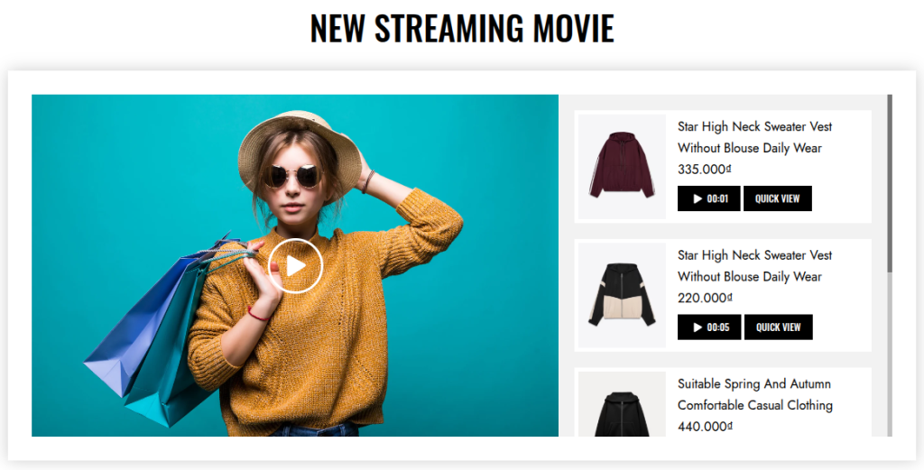
The Video live section allows you to showcase products that appear at specific timestamps within the video. This feature helps highlight items in sync with the video content, making it easier for customers to discover and engage with products as they are introduced.
This section is especially useful for store owners who frequently use videos to present or promote their products, creating an interactive and dynamic shopping experience.
Scope
Can be displayed in the Main area of all pages.
Settings
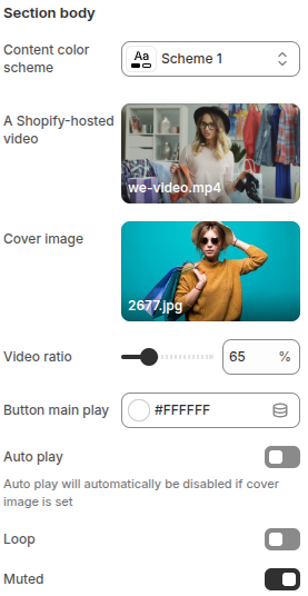
- Content color scheme: Choose the color scheme for the section’s content.
- A Shopify-hosted video: Upload a video file directly hosted on Shopify to display in the section.
- Cover image: Upload an image to use as the video’s cover (thumbnail).
- Video ratio: Adjust the video aspect ratio (%) to control how the video is displayed.
- Button main play: Choose the color for the main play button displayed on the video.
- Auto play: Enable this option to automatically play the video when the page loads. Note: this will be disabled if a cover image is set.
- Loop: Enable this option to replay the video continuously.
- Muted: Enable this option to mute the video sound by default.
Blocks
Block: Product
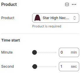
- Product: Select a product from the store to link with the video.
Time start: Define the exact moment in the video when the product will appear.
- Minute: Set the starting minute.
- Second: Set the starting second.
Marquee image
This section allows you to create a marquee-style scrolling image strip to highlight your brand, collections, or visual accents on the website.
- You can upload multiple images, and they will automatically display in a continuous horizontal scrolling effect.
- The motion effect makes your website more dynamic and helps capture customer attention instantly.
- It can be used to showcase brand logos, product collections, or decorative visuals that match your store’s style.
Scope
Can be displayed in the Main area of all pages.
Settings
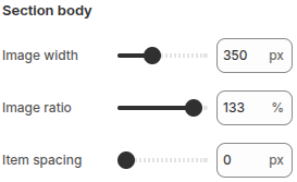
- Image width: Adjust the width of each image displayed in the marquee strip.
- Image ratio: Adjust the image ratio (%) to control how images are cropped and displayed.
- Item spacing: Set the spacing between images within the marquee to control overall layout and visual balance.
Blocks
Block: Item
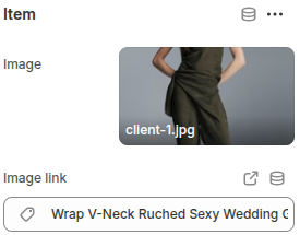
- Image: Upload an image to display within the marquee scrolling strip.
- Image link: Add a link to the image so that when customers click on it, they are directed to the specified page (e.g., product, collection, or external URL).
Multicolumn

This section is designed to display multiple pieces of content side by side in a column layout. It is highly flexible and can be used for different purposes such as introducing team members, highlighting features, or showcasing services. Each column can include an image, heading, subheading, and description text to create a visually balanced presentation.
The section is ideal for presenting structured information in an engaging and easy-to-read format, helping customers quickly understand the content being highlighted.
Scope
Can be displayed in the Main area of all pages.
Settings
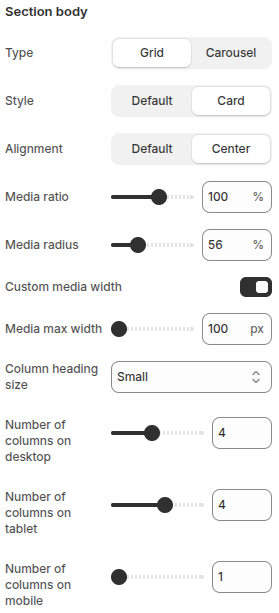
- Type: Choose how the content is displayed:
Grid: Display the columns in a grid layout.
Carousel: Display the columns in a horizontal slider. - Style: Select the display style of each column:
Default: Standard display.
Card: Display each column inside a card layout. - Alignment: Control the alignment of the content:
Default: Use the default alignment.
Center: Center-align the content. - Media ratio: Adjust the aspect ratio of the media (image/video) in the columns.
- Media radius: Adjust the corner radius of the media, controlling how rounded the edges appear.
- Custom media width: Toggle to enable or disable custom media width.
- Media max width: When Custom media width is enabled, define the maximum width of the media (in px).
- Column heading size: Choose the font size for the column headings.
- Number of columns on desktop: Defines how many product columns are shown on desktop devices.
- Number of columns on tablet: Defines how many product columns are shown on tablets.
- Number of columns on mobile: Defines how many product columns are shown on mobile devices.
Blocks
Block: Item
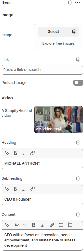
- Image:
Image: Upload or select an image to display in the block.
Link: Add a link to make the image clickable.
Preload image: Toggle to enable or disable image preloading for faster display. - Video:
A Shopify-hosted video: Option to add a Shopify-hosted video. - Heading: Enter the main title text for the block.
- Subheading: Add a short subtitle or role description.
- Content: Add descriptive text or additional details to display under the heading and subheading.
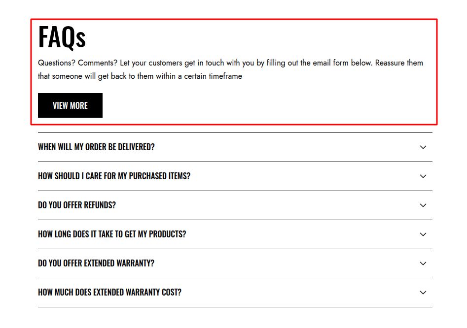
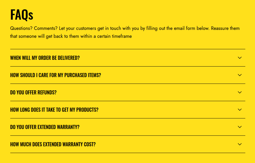
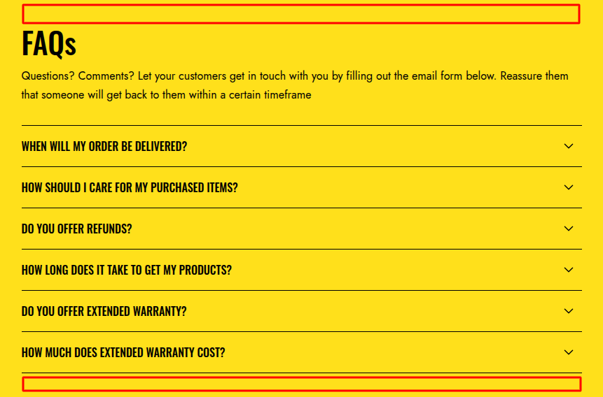
Faqs
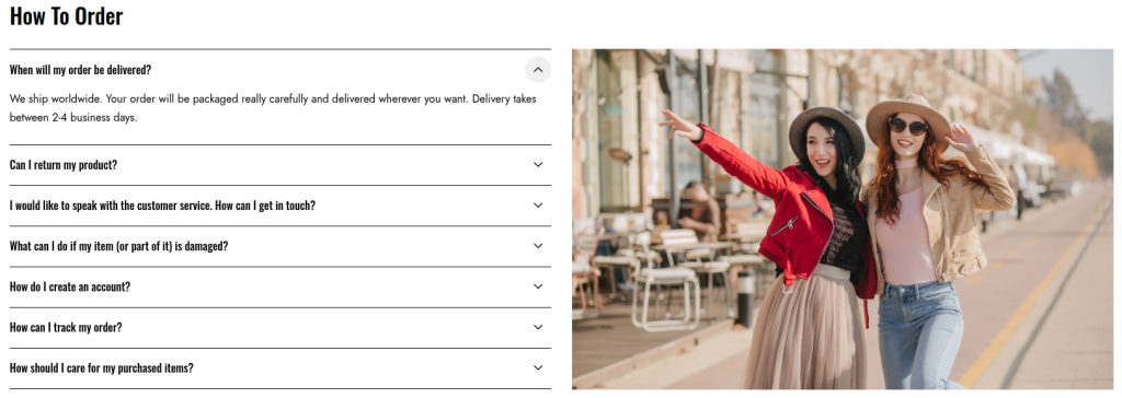
The FAQs section allows you to display frequently asked questions along with their answers in an organized and user-friendly format. This section helps customers quickly find important information, reduces support requests, and improves the overall shopping experience.
Scope
Can be displayed in the Main area of all pages.
Settings
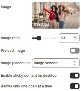
- Image: Upload an image to display alongside the FAQ content.
- Image ratio: Adjust the image ratio (%) to control how the image is cropped and displayed.
- Preload image: Enable this option to preload the image for faster display performance.
- Image placement: Choose the image position relative to the FAQ content (e.g., image first or image second).
- Enable sticky content on desktop: When enabled, the content area will remain fixed (sticky) while scrolling on desktop view.
- Allows only one open at a time: Enable this option so only one FAQ item can be expanded at a time, collapsing the others automatically.
Blocks
Block: Item
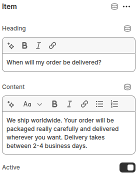
- Heading: Enter the question or title for the FAQ item.
- Content: Add the answer or detailed explanation that will be shown when the FAQ is expanItemded.
- Active: Enable this option if you want the FAQ item to be expanded by default when the page loads.
Email signup
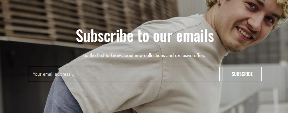
This section allows customers to subscribe to your store’s newsletter by entering their email address. It helps store owners build a subscriber list for marketing campaigns, product updates, and promotions.
Scope
Can be displayed in the Main area of all pages.
Settings
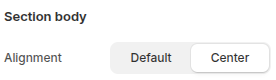
- Alignment: Choose how the text content is aligned within the section.
Default: Uses the theme’s standard text alignment.
Center: Aligns the text content to the center for a more balanced layout.
Blocks
Block: Heading
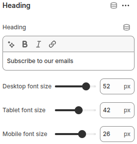
- Heading: Enter the text you want to display as the section heading.
- Desktop font size: Set the heading font size for desktop screens (px).
- Tablet font size: Set the heading font size for tablet screens (px).
- Mobile font size: Set the heading font size for mobile screens (px).
Block: Text
- Text: Enter the text content to be displayed.
- Text Scale: Adjust the overall size of the text proportionally by percentage, ensuring readability across devices.
Block: Form
Displays the email sign-up form for customers to enter their email addresses.
Block: Spacing
The Spacing block is used to create vertical spacing between blocks within the Image Banner, helping improve readability and layout balance.
- Desktop Spacing: Adjust the amount of spacing (in pixels) displayed on desktop devices.
- Tablet Spacing: Adjust the spacing specifically for tablet devices.
- Mobile Spacing: Adjust the spacing for mobile devices to ensure proper layout across all screen sizes.
Page title
The Page Title section is used to display the title of the current page, helping customers easily identify the content or context of the page.
Scope
Can be displayed in the Main area of all pages.
Settings
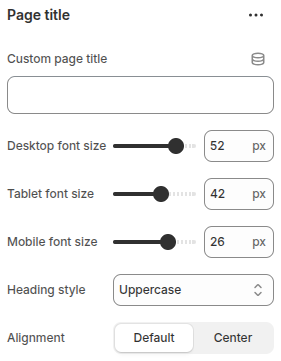
- Custom page title: Enter a custom title to display instead of the default page title. Useful for adding more descriptive or marketing-friendly headings.
- Desktop font size: Adjust the page title font size specifically for desktop devices, ensuring readability on larger screens.
- Tablet font size: Set the font size for tablet devices to maintain proper balance and layout.
- Mobile font size: Define the font size for mobile devices, optimizing the title’s visibility on smaller screens.
- Heading style
Choose the text style for the page title:
Default: Displays the title in its normal text style.
Capitalize: Capitalizes the first letter of each word.
Uppercase: Displays the entire title in uppercase letters. - Alignment: Control the alignment of the page title:
Default: Uses the theme’s standard alignment.
Center: Centers the page title within the section.
Collection banner
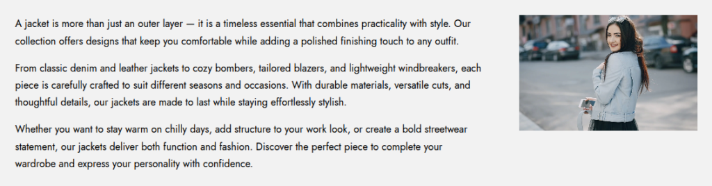
The Collection banner section displays key information about a collection, such as the collection image and collection description.
Scope
This section is only displayed in the Main area of a collection page.
Settings
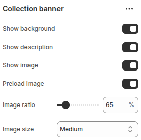
- Show background: Toggle to display or hide the collection background.
- Show description: Toggle to show or hide the collection description.
- Show image: Toggle to display or hide the collection image.
- Preload image: Enable to preload the collection image for faster display.
- Image ratio: Adjust the product image ratio (%) to control how images are cropped and displayed.
- Image size: Select the display size of the collection image.
Product grid
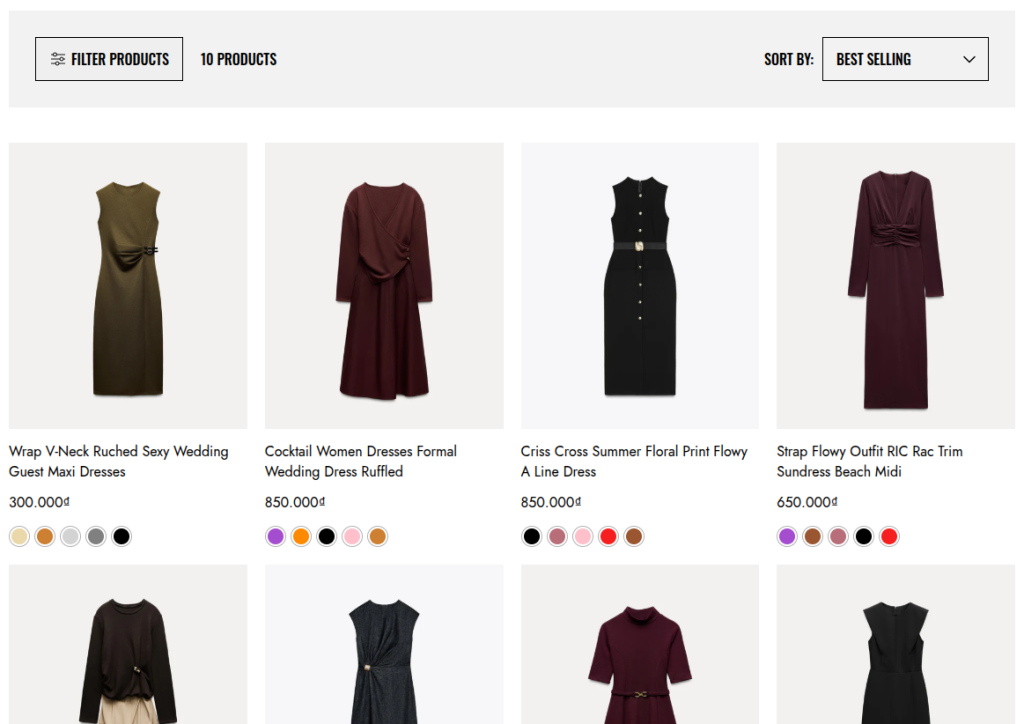
The Product grid section displays a list of products from a selected collection. It also supports built-in filtering and sorting (Sort by) options, helping customers refine and organize products with ease.
Scope
Only available in the Main area of the Collection page.
Settings
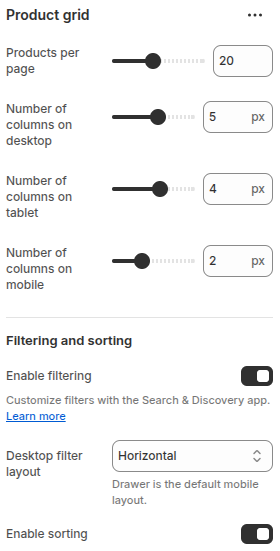
- Products per page: Allows you to set the maximum number of products displayed per page.
- Number of columns on desktop: Defines how many product columns are shown on desktop devices.
- Number of columns on tablet: Defines how many product columns are shown on tablets.
- Number of columns on mobile: Defines how many product columns are shown on mobile devices.
Filtering and sorting
- Enable filtering: Allows customers to filter products using filters set up with the Search & Discovery app.
- Desktop filter layout: Choose how filters are displayed on desktop. Options include Horizontal, Vertical or Drawer (Drawer is the default on mobile).
- Enable sorting: Allows customers to sort products (e.g., by price, date, best-selling, etc.).
Viewed products
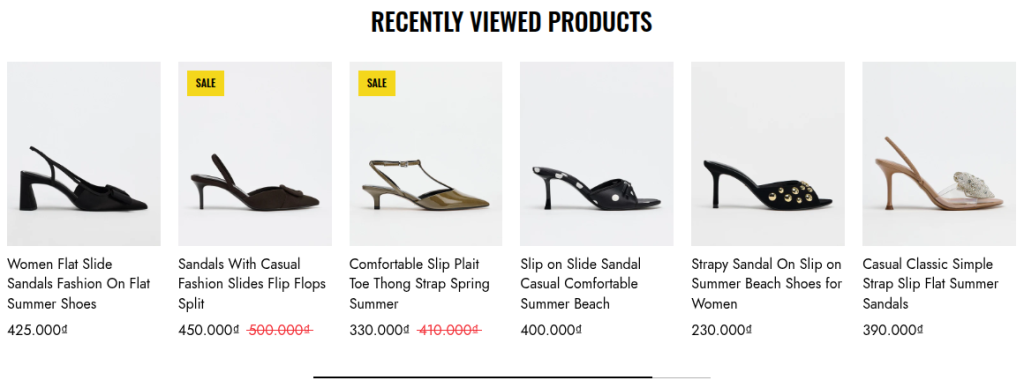
This section displays the products that customers have recently viewed. It helps users easily return to items they showed interest in.
Scope
Can be displayed in the Main area of all pages.
Settings
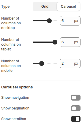
- Type – Choose how the products are displayed:
Grid: Products are shown in a standard grid layout, arranged by rows and columns.
Carousel: Products are shown in a horizontal slider (carousel) that can scroll through items, with optional navigation, pagination, and scrollbar controls. - Number of columns on desktop: Choose how many products per row on desktop.
- Number of columns on tablet: Choose how many products per row on tablet.
- Number of columns on mobile: Choose how many products per row on mobile.
- Show Navigation: Enables Next and Previous buttons, allowing users to easily navigate between slides.
- Show Pagination: Displays pagination dots that represent each slide, allowing quick navigation.
- Show Scrollbar: Displays a horizontal scrollbar for slide navigation.
Related products
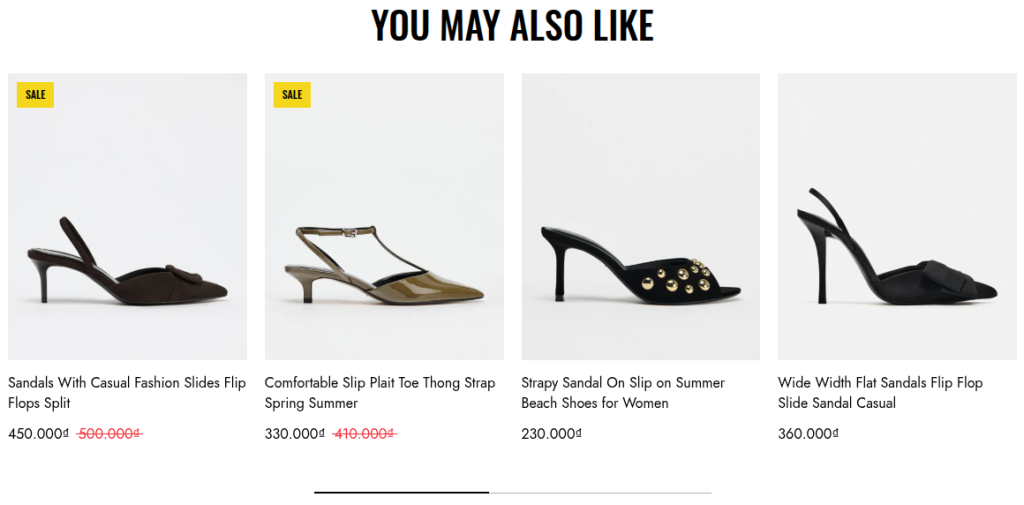
The Related Products section is designed to showcase products that are similar or complementary to the one currently being viewed. It helps increase product discovery and encourages customers to explore more items, potentially boosting cross-selling and upselling opportunities.
Scope
This section is only displayed in the Main area of the product detail page.
Settings
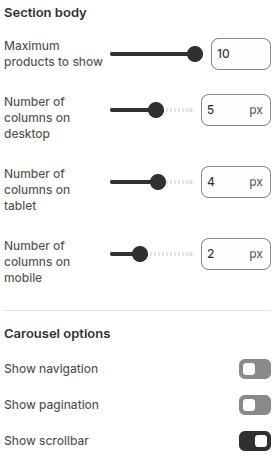
This section shows related products in a slider carousel. The settings include:
- Maximum products to show: Set how many products to display.
- Number of columns on desktop: Choose how many products per row on desktop.
- Number of columns on tablet: Choose how many products per row on tablet.
- Number of columns on mobile: Choose how many products per row on mobile.
- Show Navigation: Enables Next and Previous buttons, allowing users to easily navigate between slides.
- Show Pagination: Displays pagination dots that represent each slide, allowing quick navigation.
- Show Scrollbar: Displays a horizontal scrollbar for slide navigation.
Product tab
The Product Tab section is designed specifically for the Main area of the product detail page. It allows you to organize and display detailed product information or additional content in a tabbed layout, making it easier for customers to navigate between different types of information such as product descriptions, specifications, shipping details, or other custom content.
Scope
This section is only displayed in the Main area of the product detail page.
Settings
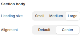
- Heading size: Choose the size of the tab headings, with options: Small, Medium, Large.
- Alignment: Control the alignment of the tab content, with options: Default or Center.
Blocks
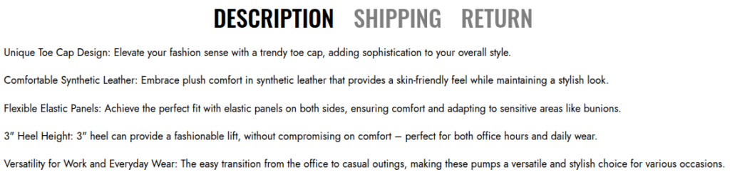
Block: Description
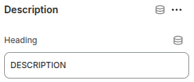
This block is used to display the detailed information of the product within a tab.
- Heading: Enter the text for the tab title.
Block: Custom
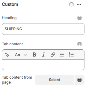
This block is used to display store-specific information such as Shipping or Return policies within a tab.
- Heading: Enter the text for the tab title.
- Tab content: Add custom text content to display inside the tab.
- Tab content from page: Select a pre-created page to load its content into the tab.
Collections list page
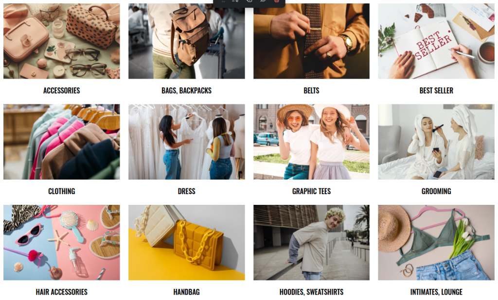
This section displays all available collections in the store, allowing customers to easily browse and explore product categories.
Scope
Only displays in the Main area of the Collection List page.
Settings
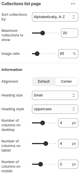
- Sort collections by: Choose how to sort collections (e.g., Alphabetically A–Z, Z–A).
- Maximum collections to show: Set the maximum number of collections displayed.
- Image ratio: Adjust the product image ratio (%) to control how images are cropped and displayed.
Information
- Alignment: Set text alignment (Default or Center).
- Heading size: Choose the heading size.
- Heading style: Define the heading style (e.g., Uppercase).
- Number of columns on desktop: Define how many product columns are displayed on desktop devices.
- Number of columns on tablet: Define how many product columns are displayed on tablet devices.
- Number of columns on mobile: Define how many product columns are displayed on mobile devices.
Contact form
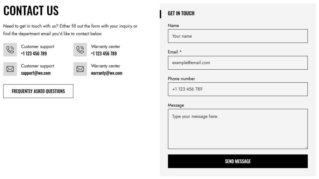
This section provides a contact form that allows customers to easily send inquiries directly through the store. In addition to the form, it can also display contact information such as a phone number and email address, giving customers more ways to reach out.
Scope
Can be displayed in the Main area of all pages.
Settings
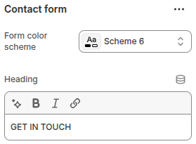
- Form color scheme: Allows you to select a color scheme for the contact form to match your store’s design and branding.
- Heading: Allows entering the title of the contact form.
Blocks
Block: Heading
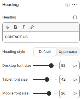
- Heading: Enter the heading text.
- Heading style: Choose between Default or Uppercase text.
- Desktop font size: Adjust the heading size for desktop displays.
- Tablet font size: Adjust the heading size for tablet screens.
- Mobile font size: Adjust the heading size for mobile devices.
Block: Text
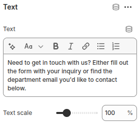
- Text: Allows entering the content to display in the block.
- Text scale: Adjusts the text size, providing flexibility in how the content is emphasized.
Block: Phone
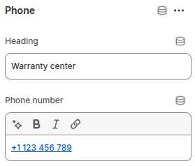
- Heading: Enter the title for the Phone block.
- Phone number: Input field to display the store’s contact phone number.
Block: Email
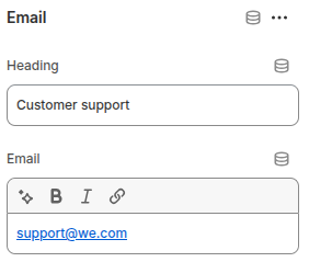
- Heading: Enter the title for the Email block.
- Email: Enter the store’s contact email address.
Block: Buttons
This block provides two buttons (First button and Second button). Each button includes the following configurations:
- Button label: Enter the text to display on the button. If left blank, the button will be hidden.
- Button link: Add the link for the button to navigate when clicked.
- Open this link in a new window: Enable this option if you want the button link to open in a new browser tab/window.
- Use outline button style: Toggle this option to use an outline style for the button instead of the default solid style.
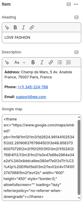
Google map
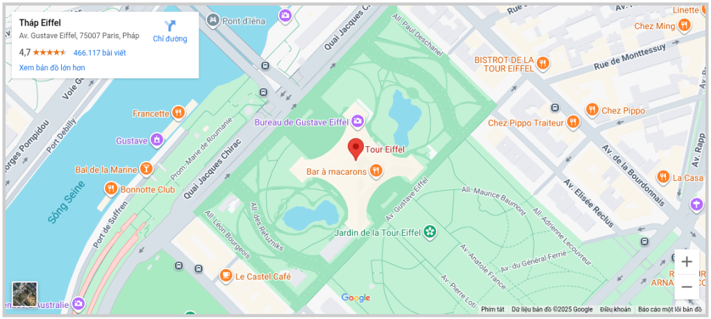
The Google Map section allows you to embed a map directly on your store pages, making it easier for customers to locate your physical store, office, or event location. This section is especially useful for businesses with offline presence, helping improve trust and accessibility.
Scope
Can be displayed in the Main area of all pages.
Settings
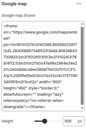
- Google Map iframe: Enter the embed code (iframe) provided by Google Maps to display your selected location on the website.
- Height: Set the height of the Google Map displayed on the website.
Customer review
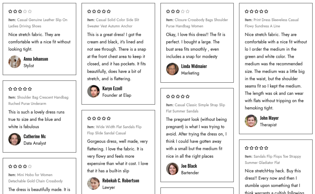
The Customer Review section allows you to display testimonials or feedback from your customers in an engaging way. This section helps build trust, improve credibility, and highlight positive experiences with your products or brand. Each review can include customer details, their feedback, and optional ratings, making it easier for visitors to see real opinions before making a purchase.
Scope
Can be displayed in the Main area of all pages.
Settings
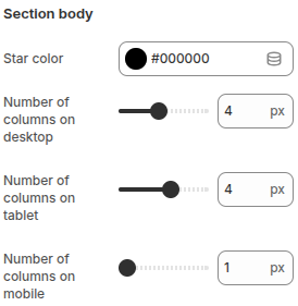
- Star color: Select the color for the star rating icons displayed in each review.
- Number of columns on desktop: Define how many product columns are displayed on desktop devices.
- Number of columns on tablet: Define how many product columns are displayed on tablet devices.
- Number of columns on mobile: Define how many product columns are displayed on mobile devices.
Blocks
Block: Item
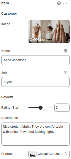
- Image: Upload a customer’s photo to display alongside their review.
- Name: Enter the customer’s name.
- Job: Add the customer’s job title.
- Rating (Star): Set the star rating given by the customer (e.g., 1–5 stars).
- Description: Write the customer’s testimonial or feedback about the product.
- Product: Select the product related to the review. Customers can view details or link the review to the product.
Store locator
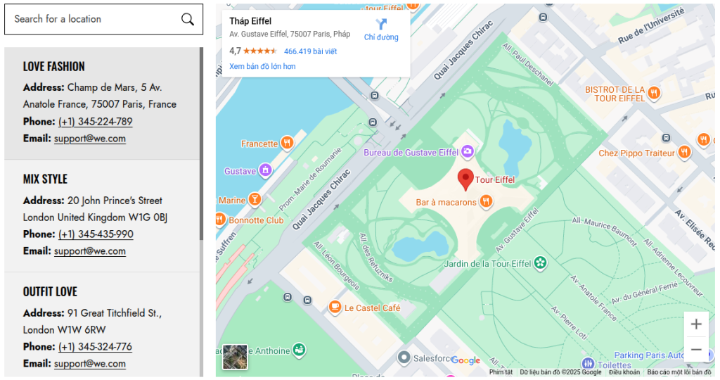
The Store Locator section helps customers easily find your physical store locations directly on your website. It integrates with Google Maps to display addresses, making it simple for visitors to locate nearby stores, showrooms, or offices.
This section is especially useful for brands with multiple retail locations, as it enhances customer experience by providing clear directions and accessibility information.
Scope
Can be displayed in the Main area of all pages.
Settings
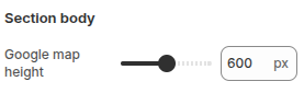
- Google map height: Adjust the height of the embedded Google Map displayed on your website.
Blocks
Block: Item
Each block represents a single store location with customizable details.
- Heading: Enter the title or name of the store location to be displayed.
- Description: Add detailed store information such as address, phone number, email, or business hours.
- Google map: Embed the Google Map iframe code to display the store’s location directly on the website.
Related posts
Release notes
Version: 1.0.0
The theme has been fully built and is now ready for use.